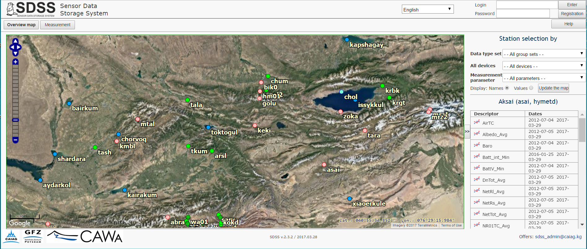
Page Overview Map is used to display the station location on the Google map
The color of station symbols, their names and coordinates can be changed on the page Input Data Groups and Station of Page set Settings. Initially, all the center part of the page is filled with the map. If you click on the "<<" button on right of the map, the panel to set a filter and to display a station information will appear. To hide this panel, click the ">>" button between it and the map.
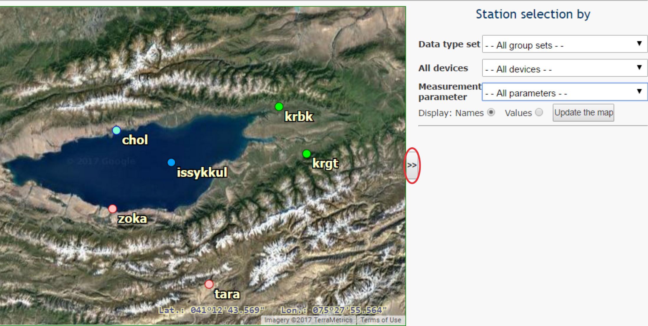
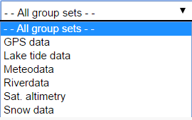
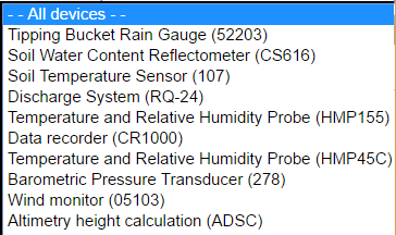
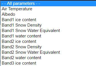
Three lines of the filter under words "Select stations by" at top of the panel are intended to select a station subset that has to be displayed on the map in according to the filtering conditions. The stations can be selected by the data group set, used device or measurement parameter.
 |
 |
 |
Below of three filter lines is located a line Display with two radiobuttons Name and Values, followed by the button Refresh map. By default, active radiobutton is Name, which means that the station names are displayed on the map near to their symbols. If you turn on the radiobutton Value, the values of the parameter selected in the filter are displayed on the map
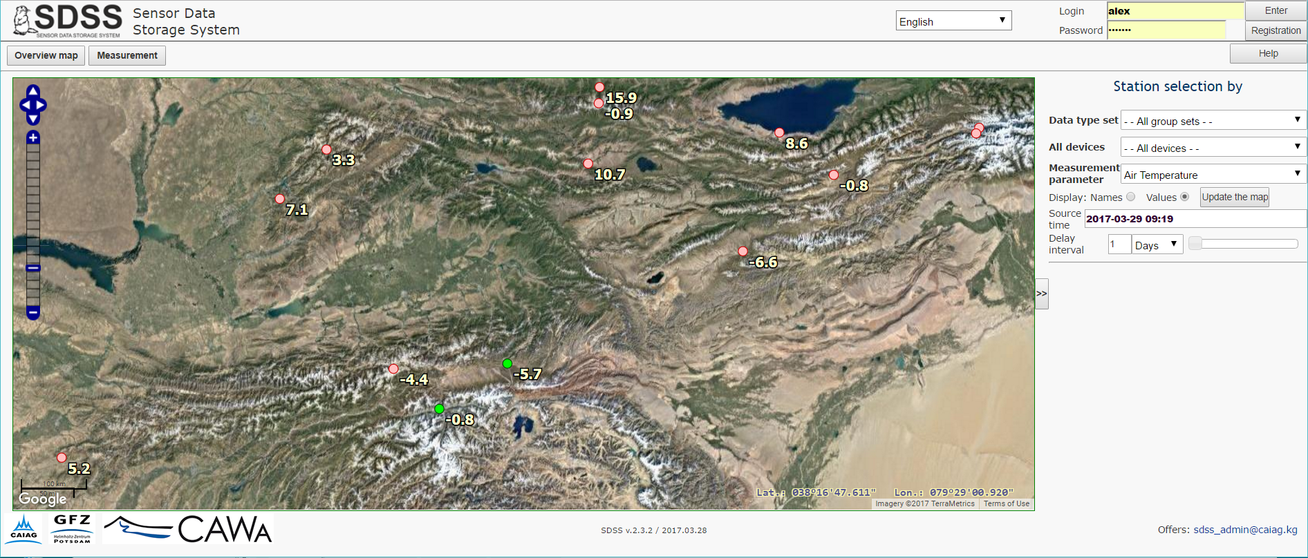
Select a necessary Measurement parameter, for example, Air temperature as is shown on the figure above, click the buttons Value, set the Initial time (the default time is current) and Delay interval counted out from the Initial time, and select the units for the interval, for example, Days. The delay interval can be entered from the keyboard or set by the slider on right in the same line. After performing these operations, update the map with corresponding button. The average values of the selected parameter for time interval immediately preceding to initial time appear on the map instead of the station names. In the example in the figure above, the average air temperature for the period from 20 hours 3 minutes of March 17 to 20 hours 3 minutes of March 18, 2017 is displayed.
If you click on the station symbol, a table with a list of
parameters (descriptors) measured at this station will be displayed on
the panel below the filter. Each line of the left column contents the icon
 , clicking on which you can plot a time series for the selected station and measured parameter in a separate window. The right-hand column
shows the dates of first and last measurements of this parameter.
, clicking on which you can plot a time series for the selected station and measured parameter in a separate window. The right-hand column
shows the dates of first and last measurements of this parameter.