on the page Map
and Measurements
as well as clicking the button Build
a chart on the page Measurements.
on the page Map
and Measurements
as well as clicking the button Build
a chart on the page Measurements.Time series plot is built in separate window
activated by clicking the icon on the page Map
and Measurements
as well as clicking the button Build
a chart on the page Measurements.
The window consists of a chart area with the heading at the top of it, the ordinate axis with a scale and a measure unit on left, the abscissa axis with a time scale and a date/time inscription on the bottom and the time series plot inside the chart area.

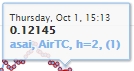
Under the date/time inscription there is a legend
where the color symbol shows how the time series is
displayed on the chart. After it the station short name, data
descriptor, sensor height above the ground and (in brackets) the
digital ID of the time series in the database follow. If several time series are plotted in one
window, then each of ttime series is presented in the legend. Below the
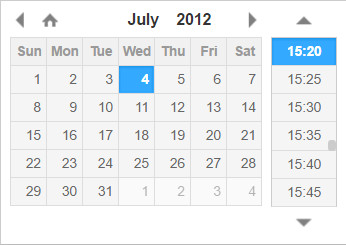
legend the window contents fields for displaying and editing
the initial and final date/time, in which you can specify a
time range of the plot. When you click on the field
with date/time, a small window appears. In it you can select the date
and time graphically.
For the time series chart, several operations can be performed: offset along the abscissa axis, scale change, output of data and images to file, removal of individual points on the plot. Graphical images of the time series plot can be saved to file of PNG, JPG, PDF or SVG formats. To save it, click the button (three dashes) in the upper right corner of the chart window and in the newly opened pop-up list
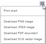
select a necessary line. The values of all time
series shown in the chart window can be output in digital form to XML
file, which is then opened in MS Excel. For the output, you need to
click the button with the image of the floppy  in the lower right corner of the chart window. The
file will content only those values that are within the range between
the minimum and maximum dates on the chart.
in the lower right corner of the chart window. The
file will content only those values that are within the range between
the minimum and maximum dates on the chart.
To acсelerate the output of time series to the plot, its values are previously averaged. The real values from the database (one value at a single point of the plot) are displayed, if only the plot is significantly stretched. Moving the plot to left oand right is executed by dragging it by mouse with its left button pressed. After releasing the button, the plot will be moved. To change the scale the plot along the abscissa axis, put the cursor on the plot and move it with the Ctrl or Shift key pressed on the keyboard and pressed left mouse button.
After releasing the mouse button, the plot will
expand or shrink. When zooming in (moving the cursor to the right), the
selected part of the plot with the pink
background widens to the whole window, and when zooming out
(moving the cursor to the left), the entire window plot will be
compressed into the selected bluish rectangle. When you hover the
cursor on the points of the plot, the name of the time series, date and
value of the point are displayed in
the appeared small window.